


Baked Alaska
Baked Alaska, a marijuana edible manufacturer in Fairbanks, Alaska, sought a comprehensive rebrand to reflect their Alaskan identity and unique commitment to health-conscious, high-quality cannabis products. With roots in a family-owned bakery, the brand sought to blend their legacy with a modern, artisanal aesthetic that resonates with a diverse customer base across Alaska.
Deliverables:
Custom Logo Suite
Brand Style Guide
Cookie Bag Packaging
Healing Balm Labels
Website Design + Build
Merchandise Design
Exploration + Process
The logo needed to:
-
re-establish the company as a healthy edibles bakery focused on high quality products providing a safe and positive cannabis experience.
-
celebrate the unique landscape of Alaska, be timeless, and display a frontier mentality.
-
convey a pure cannabis standard, reflecting the traditional infusion method used in their bakes.
-
embody a health and wellness spirit to inspire consumers to connect with themselves and seek transformative experiences.
-
be a vessel for advocacy in the industry, and amplify their voice for equitability.
-
be versatile to work effectively on
printed goods, packaging, garments, social media, and online.

The Challenge
Baked Alaska faced several challenges:
-
The existing logo and branding lacked a connection to Alaska’s distinctive landscapes, which were necessary to stand out in the local market.
-
Packaging needed an update to better reflect the artistic and high-quality nature of the products, while maintaining functionality for transport across Alaska.
-
Aligning their visual identity with their core values of health, wellness, and environmental consciousness, while advocating for equitability within the cannabis industry.
-
Specific design needs included new product names, updated labels for baked goods and balms, and versatile branding elements for packaging, merchandise, digital goods, and promotional materials.
Development
To address these challenges, I first explored a logo mark that highlighted elements of Alaska with the iconic marijuana leaf. This resulted in many concept sketches which ultimately led to the new logo suite.
The Logo
The refreshed logo highlights the “Alaskness” of the brand, integrating a bear bust silhouette with a baked good for its nose.
This mark has an artistic and timeless approach, ensuring ease of use, responsiveness, accessibility and relevance for all demographics.


Color + Type
The typography was selected to balance functionality with personality. Calder adds a bold, playful touch with a distinctive and approachable look. Its rounded forms add a handcrafted feel, perfect for conveying a sense of artistry. This is complemented with Heritage Sans for a hint of a vintage, classic vibe. Bitter is a modern serif font with excellent legibility, and is a classic yet contemporary style. The final touch is a custom font in my own handwriting, to further convey the handcrafted feel. This combination creates a layered and dynamic visual identity, adaptable for both print and digital applications.
The chosen color palette represents a harmonious blend of warm and cool tones, reflecting both a sense of sophistication and approachability. This carefully curated palette, sampled from Alaskan landscapes, ensures versatility and allows for a cohesive brand presence across various platforms and materials.

iconography
To further enhance the brand's visual identity, I developed a set of custom icons that align seamlessly with the overall design aesthetic. These icons are clean, modern, and versatile, designed to convey key brand elements in a simplified yet impactful way. These icons add depth to the brand's visual language while ensuring consistency across all applications.

"Brianna is the unique blend of vision, work ethic, organization and unbelievable artistic talent. She has been integral to our growth over the last six months and I cannot thank her enough."
Ryan Hallsten
Owner, Baked Alaska, LLC
Packaging
Before the rebrand, the packaging featured bold colors with a large logo placement, in an attempt to stand out.
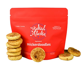


The new cookie bag packaging was designed as a piece of art, featuring iconic Alaskan landscapes like tundras, glaciers, and mountains from Sitka, Juneau, Fairbanks, and more. The artwork matches the new names of the products, dubbed after Alaskan locations, and creates collectible appeal and enhances shelf presence in gift shops and retail locations. The colors were curated to align with the new brand palette, and the new iconography was used for important features. I worked directly with the manufacturer to proof, press proof, and produce the new bags.


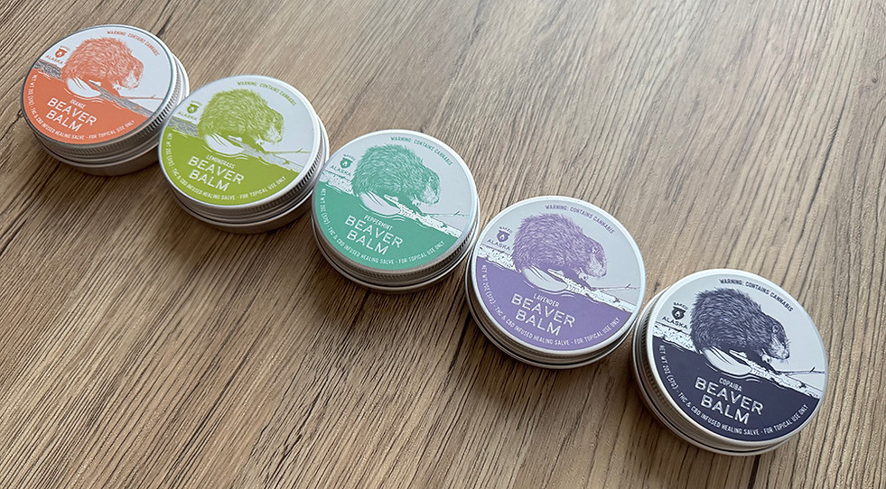
My client also renamed their THC & CBD-infused healing salve after Beaver, Alaska, and asked for a detailed beaver illustration as the centerpiece. I paired it with a silver-foiled birch log to give it that elevated yet rugged vibe. Each scent has its own distinct color, carefully chosen to align with the scent profile and fit seamlessly into the fresh new brand palette. I worked directly with the label company to order, proof, and produce the new labels.


"We are going to have the most unique and beautifully curated packaging for our business and specific market. She took my ideas and vision and turned it into a stunningly vibrant reality. When I look at what she has created I am spellbound. I am giddy with excitement to get our new bags out there for the world to see and enjoy. If you can imagine it, Brianna will make it a reality."
Ryan Hallsten
Owner, Baked Alaska, LLC
Branding Extensions
I also designed and created coordinated branding elements for tissue paper , stickers, inserts, and a mailing boxes for an elevated unboxing experience, all so the bakery can attract new stockists with a bespoke sampler box.


outcome
The rebranding project for Baked Alaska demonstrates the power of aligning visual identity with a company’s core values and market positioning. By celebrating Alaska’s unique landscapes and reinforcing the company’s commitment to quality and health, the rebrand not only elevated the brand’s aesthetic but also strengthened its connection to its audience. Baked Alaska is now well-positioned as a leader in the Alaskan cannabis industry, offering artisanal edibles that are as iconic as the landscapes they represent.
"Brianna is as business savvy as they come. She has an incredible eye and sense of where a business can go. She seamlessly blends the ideas of her clients, into beautiful works of art with her own unique touches. She is kind, she is hardworking, she meets every deadline. She is a bright star the Fairbanks business community is lucky to have. I hope others seeking to revitalize or freshen up their brands will seek her support and endless talents. They will not be disappointed."
Ryan Hallsten
Owner, Baked Alaska, LLC