


Denali Brewing Co.
Denali Brewing Co wanted to update a couple of their can labels, as the existing artwork was outdated or wasn't working with the product.
Deliverables:
Digital Illustrations
Label Designs
Outcome:
Custom label design for two canned beers
AGAVE

Exploration
Denali Brewing Co aimed to update the label on their Agave Gold beer. Brewed with organic blue agave nectar, I explored a "North meets South" concept for the artwork.
The concept features a compass rose, a nod to the existing label art, layered with Mexican agave plants on the bottom, and mirrored with Alaskan caribou antlers around the top. The two cultures meet around the compass as well, with traditional Mexican patterns along the bottom and traditional Alaskan patterns along the top.


Before + After
The original artwork featured a compass rose with an array of icons all around. With the new design, the company aimed to highlight the blue agave nectar that makes this brew stand out. Retaining the gold color of the band was essential, and that was complemented throughout the design.


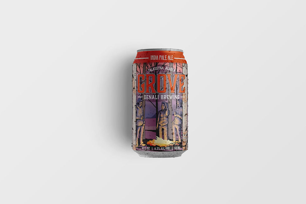
GROVE

Exploration
Next up was the label for the Grove IPA, which was named after a favorite spot in an opening in the woods for a group of friends to gather. The artwork aimed to inspire a whimsical or magical "gathering place" to tell this story.
This one was challenging, and went through several iterations throughout a full year. I was able to pivot and provide updated or new concepts with every round of feedback.


Recognizing that the realness and picturesque landscape of raw Alaska is what this art needed, I went to the woods – literally. The real-life, grove-like reference and place-based inspiration pushed the project forward in the right direction for the client.
We then incorporated a rendition of a hand-painted mural on the walls at the brewery, featuring three figures around a fire at the foot of a mountain, to fully bring in the story of "a gathering place."


Before + After
The original design featured an orange slice encircled in a tree motif on a black background. While this American-style IPA is well balanced with strong citrus, earthy and pine aroma and flavor, it was often mistaken to be an orange-flavored brew.
The updated artwork excluded the citrus motif, but maintained the prominent orange color. This was complemented with hues of pinks and purples for a softer visual.

The Outcome
The artwork for both labels was completed in full color, to spec for the can labels, with consideration for all the text placement.
Raw design files were provided to the company's in-house designer, in the chance that minor edits or tweaks were needed before production.

"Working with Brianna has been a great joy. She was very pleasant to work with, she listened to all of our ideas, even when we kept evolving them. She was patient and accommodating to our asks, turning our feedback into results!"
Sasson Mossanen, Owner + Brad Wakefield, Ambassador
Twister Creek Inc, dba Denali Brewing Co.


