


small forest school
Small Forest School is an outdoor early childhood program rooted in Fairbanks, Alaska. Through play, exploration, and curiosity-led learning, children connect with nature in all seasons. The school nurtures resilience, creativity, and a lifelong love of the natural world.
deliverables:
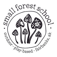
Custom Logo
Visual Identity
Brand Style Guide
Sticker Design
Journal Design
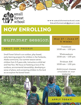
Flyer Template
design goals
-
To establish the business as the premier Forest School in Fairbanks, connecting children to the natural world and fostering a sense of community through outdoor play.
-
The visual identity should evoke a feeling of belonging and adventure, creating a welcoming space for children and their families.
-
The visual identity should convey the values of nature, childhood wonder, and playful exploration, while also reflecting a professional and established program.
-
The visual identity should reflect the "small forest ethos" of fostering children's deep connection to nature, self-discovery, and community through outdoor, hands-on learning experiences through play.
-
The visual identity should be a vessel for community, allowing children and families to proudly showcase their connection to Small Forest School through merchandise and gear.
-
The visual identity will need to be versatile to work effectively on printed goods, merchandise, social media, and online.


exploration + process
We began with a discovery process centered on their mission and philosophy of child-led play, seasonal connection, and community building. We explored how to visually capture the wonder of outdoor learning and the school’s deep ties to the Alaskan landscape. From there, the brand direction was shaped to feel natural, approachable, and imaginative. The logo was developed to balance simplicity and whimsy, evoking both the forest setting and the playful spirit of childhood.


color + type
Typography reflects playfulness and approachability while maintaining clarity and warmth. Type choices emphasize both curiosity and structure:
-
Intro Rust - organic, textured, and a little adventurous
-
Waffle Slab (lowercase) - friendly, informal, and grounded
-
Glacial Indifference - clean, modern, and easy to read
-
JetBrains Mono - precise, simple, and subtly playful
Together, these choices create a type system that feels natural, imaginative, and rooted in place.

The color palette is inspired by Alaska’s seasonal landscape; earthy, vibrant, and rooted in the natural world. Each hue captures a sense of place and the wonder of outdoor learning:
-
Cranberry (#731240) — bold, rich, and grounding
-
Lichen (#C0D4CC) — soft, calming, and fresh
-
Mushroom (#BF942D) — warm, golden, and organic
-
Aspen Leaf (#8EAF5C) — lively, natural, and energetic
-
Autumn Birch (#CBC434) — bright, cheerful, and playful
-
Bark (#453F44) — deep, sturdy, and anchoring
Together, these colors create a palette that feels both adventurous and nurturing, reflecting the school’s balance of exploration, curiosity, and comfort in the natural world.

brand extensions
Beyond the core identity, the brand extends through custom illustrations and artwork that bring the forest to life. Seasonal sticker designs and a nature journal provide families with playful, lasting connections to the school’s values, while a flexible flyer template ensures consistency across enrollment materials. These touchpoints reinforce the brand’s warmth, creativity, and connection to the natural world.


outcome
Since launching the new brand, the owner has felt a renewed sense of confidence in sharing her vision.
The cohesive visual identity has elevated Small Forest School’s presence, sparking more interest and enrollment inquiries than ever before. The branding not only reflects the heart of the school but has also positioned it as a trusted, inspiring alternative for families seeking nature-based education in Fairbanks.
“I love the logo—it’s wonderful! The presentation was so lovely it made me want to start a forest school all over. Since sharing it, people are already reaching out; someone even emailed me one morning after seeing it in a newsletter. Everything feels magical, and I couldn’t be happier.”
Alison Buckingham
Owner, Teacher, Small Forest School