


Southfork Development, LLC
Southfork Development is an Alaska-based civil contracting company built for challenges. From stream restoration projects to commercial civil builds and a select handful of private jobs, Southfork specializes in the complicated and logistically demanding projects other companies can’t—or won’t—take on.
Deliverables:
Custom Logo
Visual Identity
Printed Materials
Logo Process
We began with a discovery process focused on uncovering Southfork’s values: trust, reliability, and a deep respect for Alaska’s land and people.
From there, we explored visual directions that would capture both professionalism and a sense of place. The final design direction centered on a strong yet approachable mark, designed to embody guidance, vision, and strength.

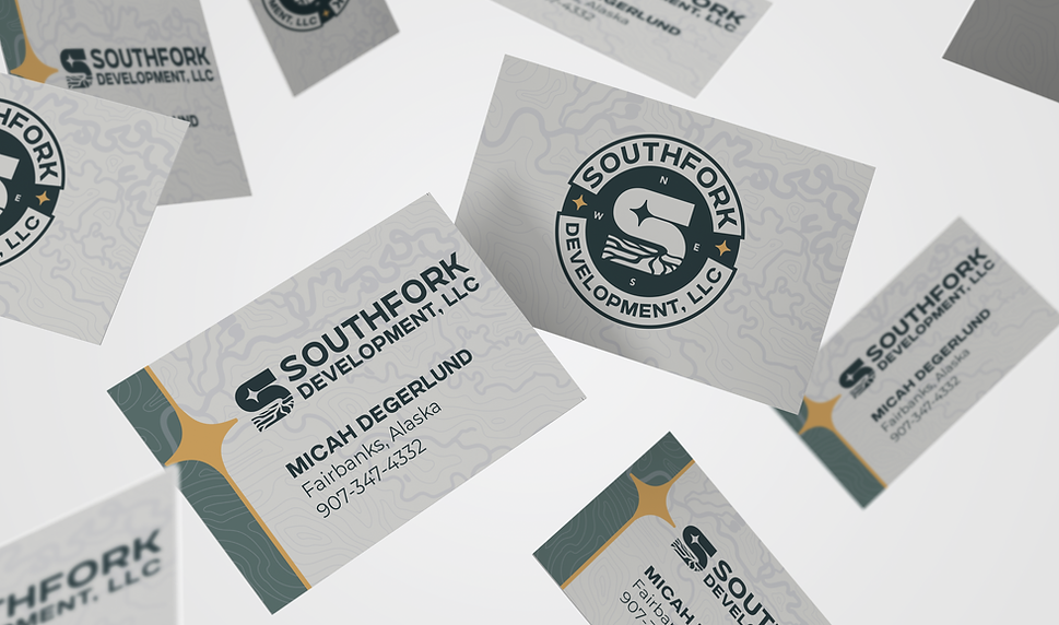
The finished logo features an “S” monogram formed by a winding river, anchored by the North Star above. Together, these elements symbolize direction, stability, and a deep tie to Alaska’s landscape. The mark is clean, modern, and versatile, equally effective on signage, print materials, and digital platforms.


Color + Type
Typography balances strength with clarity, creating a professional yet approachable system:
-
Gunterz for headings — strong, modern, and commanding
-
Montserrat Semibold for subheadings — versatile, clean, and structured
-
Montserrat Regular for body copy — simple, legible, and reliable
-
PT Mono for captions — minimal, technical, and precise
Together, these choices create a type system that communicates trust and stability while maintaining a contemporary edge.

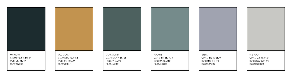
The palette draws inspiration from Alaska’s natural environment, pairing strength with subtlety:. The primary palette is a nod to the Alaskan roots with a deep navy and gold. The secondary palette brings in the silty glacial rivers.
Together, these colors reflect both the rugged and refined aspects of Southfork’s identity, grounding the brand in Alaska’s landscape while remaining professional and approachable.
Iconography
Custom icons were created to help showcase the unique capabilities of the company

"Coming soon..."
Micah Degerlund
Owner, Southfork Development, LLC


